New Mexico Health Connections

Redefining Health Insurance

What We Did.

  • Brand Strategy
  • Media Strategy
  • Brand Identity Design
  • Collateral Design
  • Advertising Campaign
    • Television
    • Video / Online
    • Radio
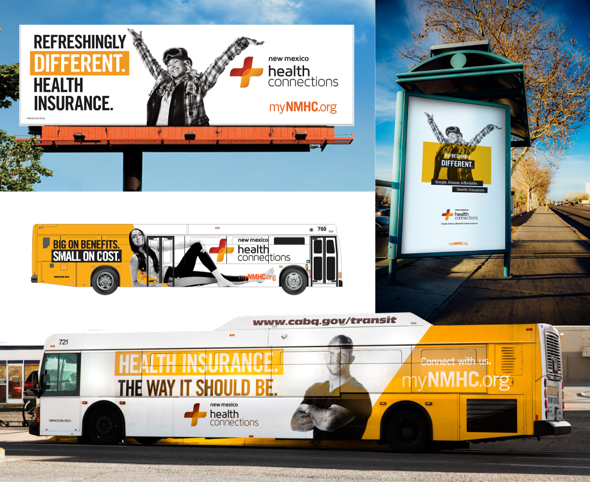
    • Out-of-Home
    • Transit
    • Print
    • Online Strategy
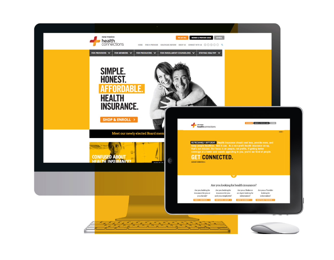
    • Website Design

Challenge.

How do you quickly build trust and grow membership in a brand-new health insurance company that has an unproven track record and low awareness and competes in a marketplace full of legacy brands? Oh, yeah… and be prepared to launch in four weeks with half the budget of the competitors. That was the challenge posed to us by the management team of New Mexico Health Connections.

This start-up, nonprofit co-op health insurance company had an experienced and passionate team of industry veterans, a unique business model and a first year of modest growth under their belt. But this was the make-it or break-it year…a time to prove to their board of directors and to the marketplace that this company can change health insurance as we know it.

In the audit and analysis phase, market research confirmed low awareness and significant confusion with another brand. It also uncovered widespread consumer distrust with health insurance organizations and frustration with complexity. Additionally, focus groups found the idea of a co-op health insurance company confusing, but they loved the notion of people-centric insurance.

Strategy.

For any product or service to succeed, it is absolutely critical to align the wants and needs of the marketplace with the offering. Though we had no initial plans to rebrand the year-old start up, our strategic brand building process clarified that the path to success required a distinct brand identity and a break from conventional health insurance advertising.

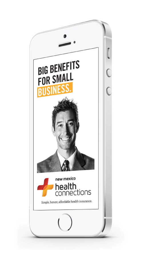
Our strategy map defined key resonant messages to align organizational philosophies and offerings with our target audience’s desires. A simple, bright yellow, black and white color palette combined with bold, graphic typography and youthful black and white photography created the aesthetic platform for a stand-out brand. Our media strategy combined a highly efficient mix of digital and traditional media channels.

Results.

The results were nothing short of amazing! The new-to-market brand built solid credibility with agents and brokers. Consumers connected with the people-centric campaign messages and membership doubled in the three months the campaign ran.

12x

industry standard click-through rate

we go where they are.

Health insurance prospects don’t fit a single demographic, psychographic and socioeconomic mold. So keeping your brand top-of-mind is all about serving engaging, relevant content exactly where they are.

By the Numbers.

104%

increase in membership

148%

above industry standards for online sucess

50%

above industry standards for online engagement

membership doubled.

change is good.

Yesterday’s approach to selling health insurance is not for today’s consumers. This campaign used a different voice in a sea of sameness to stand out and be heard.